Replacing delivery anxiety with quiet confidence.
Customers weren’t anxious about the appliance - they were anxious about the truck. The moment of truth wasn’t the product unboxing; it was the uncertainty of waiting. We redesigned Best Buy’s delivery experience to replace that anxiety with proactive, real‑time confidence.

METRICS
CARE CALLS
-47%
Where is my order?
NPS
+28
Post-delivery survey
REACH
2.3M
Annual Deliveries
TIMELINE
4 mo
Discovery to Ship
My Role:
Senior Experience Designer. End-to-end ownership from discovery through launch partnering with 2 PMs, 1 researcher, 4 engineers, and the Geek Squad team.
CUSTOMER PROBLEM
Customers were taking the day off work and still missing the truck.
The pre-existing flow surfaced one ETA window: a four-hour slot. No driver name, no live progress, no notice when the route shifted. Over a third of customers called the care line within that window - most just to ask, "is it still coming?"
CARE LOAD
34% of customers called
ANXIETY PEAK
Hour 3 of the 4-hour window
DRIVER CONTEXT
None surfaced to customers
EXPERIENCE
Before vs After
BEFORE - THE LEGACY DELIVERY EXPERIENCE
One static 12–4 PM arrival window
No driver name or crew context
No live progress or stop count
No updates when the route shifted
Customers calling support simply to ask: “Is it still coming?”
AFTER - THE REDESIGNED DELIVERY EXPERIENCE
7 AM confirmation with appointment + window
A 2‑hour delivery window replacing the industry‑standard 4
Live stop count (“We’re 3 stops away”) instead of a fragile ETA
Real‑time map with crew progress
Crew contact surfaced day‑of, not buried in old emails
Proactive notifications at every meaningful change
BUSINESS CONTEXT
A $40M failure mode hiding in plain sight
36K
Missed deliveries annually - each requiring rescheduling, re-routing, and repeat crew dispatch
$40M
Annual cost tied to a single root cause: customers had no visibility into delivery status
128K
Rescheduled appointments per year driven by customers who weren't home or weren't ready
#1
Top customer complaint in NPS and Opinion Lab data — ahead of product issues, pricing, and returns
The scale of the problem was quantified before I joined - and specific enough to demand an equally specific solution. "Unable to track delivery" was the top complaint in NPS scores and Opinion Lab data, ranking above product issues, pricing, and returns.
The opportunity wasn't just to reduce friction. It was to eliminate a quantifiable failure mode that was costing the business money on every single affected delivery.
HOW MIGHT WE
How might we give customers the same real‑time confidence Geek Squad agents already have - proactively, without requiring them to look for it?
This question became the north star. The data existed. The crews had it. Customers didn’t.
RESEARCH INSIGHTS
The notification is the product - not the app
I partnered with the research team on an unmoderated usability study with 30 customers who had appliances delivered in the past 6 months, supplemented with NPS and Opinion Lab data at scale.
Findings that changed the direction
We assumed customers wanted ETA precision. The data showed the opposite. When we tested "Arrival window 12-4 PM" against "We're 3 stops away," stop count consistently outperformed on trust — because customers knew a window could shift, but stop count was almost always accurate. That single insight overturned the product team’s original brief.
90%
80%
60%
What customers expected on delivery day
1
An early alert by 7AM confirming the appointment and estimated window
2
A 2-hour delivery window — not the industry-standard 4-hour block
3
Live tracking with stop count and map, not a static ETA
4
Crew contact available day-of — not buried in a weeks-old confirmation email
The tension I resolved:
`
Research pointed clearly to notification-first design. The product team's initial brief called for a rich in-app tracking hub. Building both would exceed the timeline and create two competing surfaces with inconsistent data. I made the case to lead with notification-first — get the right information to the customer at the right moment, and let the app be the destination they tap into.
JOURNEY MAPPING
Two journeys. One critical gap.
I ran dual journey mapping — customer and Geek Squad agent — to find where the system was breaking down.
CUSTOMER JOURNEY - 5 ANXIETY SPIKES
Night before
"Is it still happening?"
Morning of
"What time are they coming?"
Every hour of silence
No update → call support
Window elapses
No contact → escalation
Crew running late
No mechanism to know
GEEK SQUAD JOURNEY - DATA AVAILABLE BUT TRAPPED
Real-time stop count
Agents knew exactly where they were
Dynamic ETA
Visible to crew, invisible to customer
Delay reasons known
Weather, traffic, job complexity
No sharing mechanism
All of this stayed with the crew
The gap wasn't data. It was communication. Geek Squad agents had more real-time information than customers. Every one of the five customer anxiety spikes was preventable with information that already existed in the system.
FINAL DESIGNS
5 positive states. 6 failure states. All intentional.
The happy path was table stakes. The negative scenarios — the edge cases driving the majority of care calls — are where the real design work happened.
POSITIVE SCENARIOS - THE EXPECTED JOURNEY


Push Notification - 7 AM
Text Notification - SMS
Push Notifications - 7AM
Text Notifications - SMS


3 stops away
1 stop away - crew contact
Live map view
Design Principle:`
Every failure state had to answer three questions: what happened, why it matters, and what the customer can do right now. Any screen that couldn't answer all three went back into design.
NEGATIVE SCENARIOS - WHERE 47% OF CARE CALLS ORIGINATED


Product Delayed
Inclement Weather


Customer not at home

Push Notifications - 7AM
Text Notifications - SMS
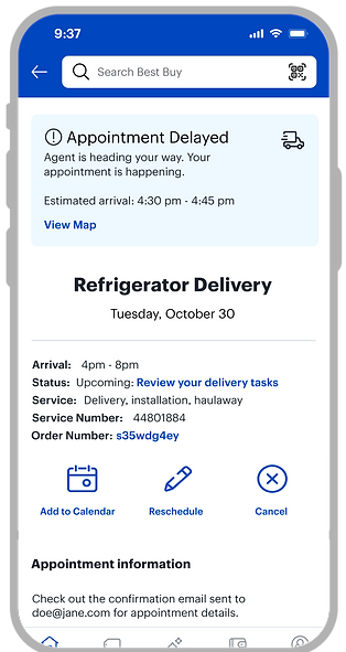
Appointment delayed
Missed Appoinment
Tracking Unavailable
DESIGN SYSTEM IMPACT
Components that outlived the project
Real-time status card
Reused in order tracking and Geek Squad appointment management
Crew contact module
Standardised contact surface surfaced at contextually correct moments
Failure state framework
Tone-by-severity, action-first copy — adopted as team standard across two follow-on projects
Three reusable components introduced into Best Buy's mobile design system — each adopted by follow-on projects within six months.
KEY DESIGN DECISIONS
Three calls that changed the outcome
01 - Stop count over time estimate
The product team wanted to show an ETA ("Arriving at 2:30PM"). I pushed for stop count ("We're 3 stops away"). ETAs are wrong constantly — traffic, job complexity, access issues. A wrong ETA is a broken promise. Stop count is almost always accurate, sets a relative expectation, and gives customers something meaningful to act on. The usability study validated both. Stop count won on trust.
Precision vs reliability — chose reliability
02 - Notification-first, app as detail layer
Rather than a tracking hub customers had to remember to visit, I designed the notification as the primary experience. Push notification → tap → live tracking with stop count, map, and crew contact. The app becomes the detail layer, not the primary surface. This matched how 90% of customers said they wanted to be reached - and kept scope achievable.
Richer app vs meeting customers where they are — chose the latter
03 - Designing negative scenarios first
Most delivery tracking UX focuses on the happy path. I insisted we design the failure states first: delayed product, inclement weather, customer not home, appointment delayed, missed appointment, tracking unavailable. Six named negative scenarios - each with a distinct message, a clear next action, and tone calibrated to severity. This is where 47% of care calls were originating.
Scope and time vs completeness - insisted on completeness
RESULTS - POST LAUNCH - 3 MONTHS
The edge cases were where the real cost was hiding
The six negative scenario states accounted for a disproportionate share of the improvement. The happy path was easy. Fixing the failure states moved the metric — and recovered measurable cost for the business.
47%
Care call reduction held steady - no regression at 3 months
22%
Of "tracking unavailable" users didn't call support — up from near zero. The crew contact fallback was doing real work.
32%
Reduction in Appointment reschedules
WHAT I LEARNED
Principles I carry into every project now
The notification is the product, not the app
Customers don't open apps to check on deliveries. They wait to be told. Designing the notification as the primary experience was the most important structural decision on this project.
Designing failure states first changes what you build
Starting with the six negative scenarios forced us to confront why customers were really calling support. The edge cases aren't edge cases — they're the product.
Stakeholder alignment is a design problem
Changing the product team's direction wasn't about preference. Framing the decision around the business metric — not design philosophy - was what moved it.