
Current Design
How I redesigned Best Buy's homepage for 8M+ users and why less personalization drove more conversions
Best Buy's mobile app served every user the same generic homepage - despite having rich behavioral data sitting idle.
I led end-to-end design of an AI/ML-powered personalization system across 6 user segments.
The counterintuitive insight: Users didn't want more content. They wanted fewer, better choices.
Impact
Increase in user engagement
69 %
Increase in user
sign ups
15.8%
Increase in order conversions
3.2%
Revenue
per
customer
2.1%

Business Context
88% of homepage visitors saw content with zero relevance to their history - yet users who engaged with relevant content converted at 3x the rate of those who didn't. Personalization had been on the roadmap for two years. This data finally made it a priority.
My Role
I led the end‑to‑end design process, from problem framing and research facilitation to Information Architecture, designing, prototyping, testing, and delivery. Partnering closely with another designer, we ran design‑thinking workshops with Product, Data, Content, and Legal teams. I conducted a UserZoom card‑sorting study, and jointly defined the component architecture and personalization logic.
The Challenge
Existing home page served all users the same static content. This generic experience led to user frustration, disengagement, and high abandonment rates. Despite having rich user data, the homepage wasn’t using it effectively to personalize experiences.
Existing Experience
.png)
Understanding the Problem
01
One homepage, 8 million different people:
Every user - first-time visitor, loyal member, lapsed customer - saw identical static content. The app had rich behavioral data but wasn't using any of it on the most visited screen.
03
Information overload, not information deficit:
The problem wasn't that users lacked content. It was that they couldn't find what was relevant to them. More modules would make this worse, not better.
02
Data sat idle while engagement dropped:
Browse history, purchase history, saved items, reward status — all unused on the homepage. Users who'd bought a TV were shown TVs again. Users with a full cart were shown onboarding content.
04
Zero-party data was stale before it was used:
Users rarely updated declared preferences after initial setup. The data team's model relied on it. Part of my role was reframing the personalisation logic around behavioural signals instead.
How might we leverage zero-party data, AI/ML model and real-time preferences to dynamically adapt content per user - leading to better engagement, satisfaction, and conversions.
Impact
Users grouped all homepage content into exactly three mental buckets — "continue what I was doing," "deals and savings," and "discover something new." Everything outside these three categories created noise. This became the IA foundation.
Key Opportunities
Identified key opportunities to serve relevant content at the right time based on customer's journey.
Identify high-value touchpoints through collaboration and mapping.
Serve relevant content aligned with the customer’s current journey.
Empower users to shape their experience.
Organize content intuitively through IA and card sorting.
Identifying high value touch points through design thinking sessions

Information Architecture
Conducted card-sorting exercise via UserZoom to organize the homepage content based on user mental models.

User Persona
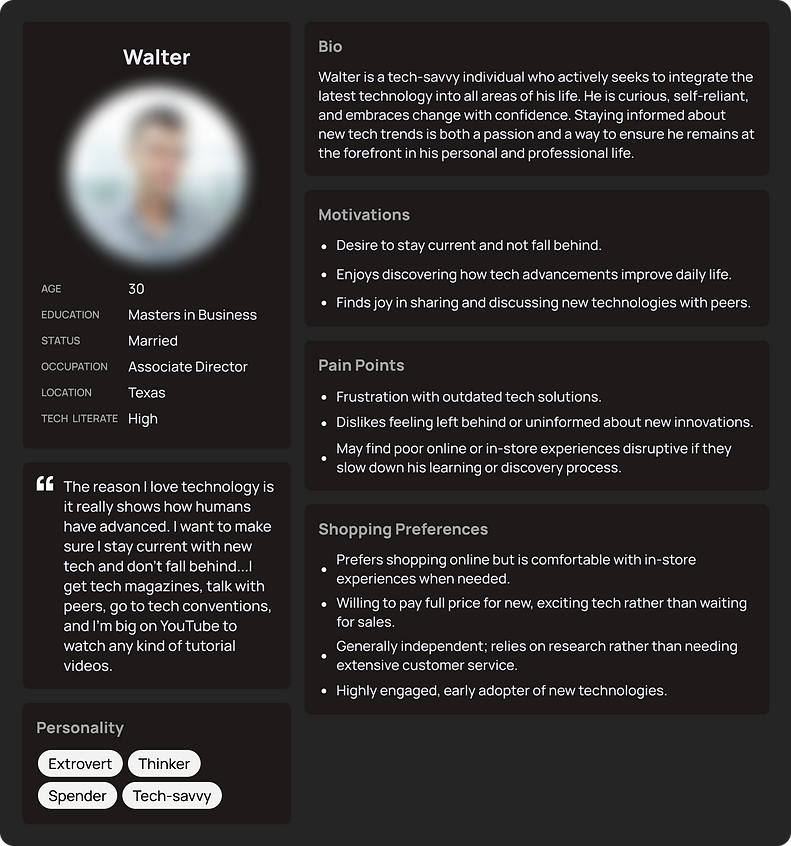
Homepage personalization is focused on segment 1 users, who are resourceful, innovative and confident in their ability to leverage the variety of tools at their disposal to make well-informed decisions.
Initial Design Iterations
Created modular layouts for different user segments, incorporating brand aesthetics and dynamic content blocks.

Customer Validation
60 users participated in a survey post-launch.
Goals:
-
Understand what users expect from the personalized homepage.
-
Evaluate awareness and perception of personalized content.
Research Findings
Identified key opportunities to serve relevant content at the right time based on customer's journey.
Used it track rewards and savings.
57 %
Recognized personalized content (based on shopping behavior - saved items and recently viewed)
60 %
Browsed deals through personalized modules.
83 %
Helped them save time and money.
46 %
Key Takeaways
01
Users recognized and appreciated personalized content.
02
Deals and limited-time events drove engagement.
03
Some users felt the layout lacked clarity or inspiration.
Recommendations
01
Balance personalized and curated content.
02
Enhance organization of deals, events, and rewards.
03
Improve visual hierarchy and findability.
Major research findings
Most users strongly agree that the content feels personalized for them.
Some users are more likely to say the homepage feels disorganized and uninspiring compared to other sections.
Design update based on research findings:
-
Personalized modules tailored to user behavior.
-
Simplified layout with focused, dynamic content.
-
Stronger visual hierarchy and clear pathways for continued shopping.
Wireframes


Final Designs


Impact
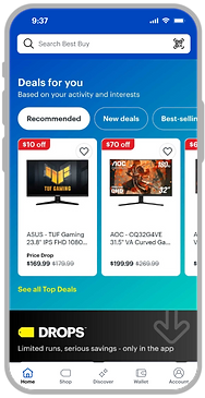
A/B testing showed significant improvements in engagement, satisfaction, and key business metrics —validating the effectiveness of the personalized experience.